What the role asked for
TikTok posted a Product Designer role focused on design engineering and AI workflow. The ask was to turn a design system into something an AI agent can generate from, then apply design judgment to the output.
Most AI-generated UI is easy to spot: generic spacing, arbitrary colors, decoration in place of decisions. The usual cause is that the model has no system to check its work against, only an instruction to match the brand.
How the rules were written
Eight reference components were hand-built as ground truth. The token file uses the W3C Design Tokens Community Group format, the same structure tools like Style Dictionary consume. Every color, type scale, spacing value, radius, and motion timing is defined there.
A separate rules file defines the checks a component must pass. The most important one is that card containers use a signature asymmetric radius of 28px 2px 28px 2px. It is what separates the design language from a generic dark card, and it is the rule the model failed most often.
How the pipeline runs
A Python script drives the pipeline. Step 1 generates a self-contained HTML component from the token file and the rules. Step 2 sends a Playwright screenshot of that component back to the model and asks it to check each rule and report pass or fail with evidence. Step 3 feeds the critique back in and asks for a revised component.
The component is a Trending Sounds panel. Sounds are audio clips attached to user videos rather than music tracks, so thumbnails show the original creator's circular avatar and the metric is how many videos use the sound.


Left: raw generation. Correct TikTok-native content (circular creator avatars, video use counts, "Use Sound" CTAs) but rule violations — Inter on the heading, uniform border-radius, three equal primary action buttons. Right: post-revision. Clash Display heading fixed, buttons differentiated (one filled primary, two outlined). Signature-cut radius still not applied.
What the critique caught
The critique step identified every rule violation in the raw output: off-token avatar colors, uniform border-radius where the signature cut was required, Inter on a heading that needed Clash Display, and three equal primary buttons breaking the action hierarchy rule.
It also flagged R6, the motion timing rule, as unverifiable from a static screenshot. It did not guess. Across every run it never claimed to have checked a rule it could not check.
The revision also fixed R7, demoting two of the three filled "Use Sound" buttons to outlined variants so there was one primary action and two secondary ones.
What the revisions kept getting wrong
Every revision improved rule conformance and dropped content at the same time. R2, the signature-cut radius, was called out in every critique and applied in none of them. The model defaulted to uniform rounding regardless of how the rule was stated.
Revisions also dropped elements no rule had flagged. If the critique said to fix the font, the revision fixed the font and removed a data row as well.
Where version one landed
The loop works well for surfacing rule violations. The critique step is accurate, clear about its limits, and produces output you can act on.
The revision step is not a final output, because it fixes some things and breaks others. The loop is most useful as a structured QA pass for a human designer.
In practice that means generating a component, running the critique, and using its output as a fix list to apply by hand.
A contradiction in the rule files
While preparing a rebuild, an audit of the constraint files turned up a problem. The rules file gave the signature radius as 20px 4px 20px 4px, and the token file gave it as 28px 2px 28px 2px. The rules file was never updated when the radius changed during the system build, so the model had been given two different values for the same rule on every run.
Version two: generate a working app
Version one asked for a component and got a picture of one. Version two changes the ask to a complete, working single-page app in one self-contained HTML document with real JavaScript: snap-scroll video feed, engagement rail with a working like state, comments sheet with a gated send button, five-tab navigation, and a profile view.
Output streams up to 64K tokens and truncation aborts loudly rather than rendering garbage, which was v1's black-screen failure. Every control carries a test hook, because the pipeline no longer just screenshots the result: Playwright renders the app at a mobile viewport, taps the like button, opens the comments sheet, and switches to the profile tab, capturing each state. A control the harness cannot click fails automatically.
The critique step now receives all four screenshots and the full source. That closed v1's biggest gap: the 120ms motion rule moved from unverifiable to confirmed in the CSS, and the functional checklist is checked against the JavaScript.
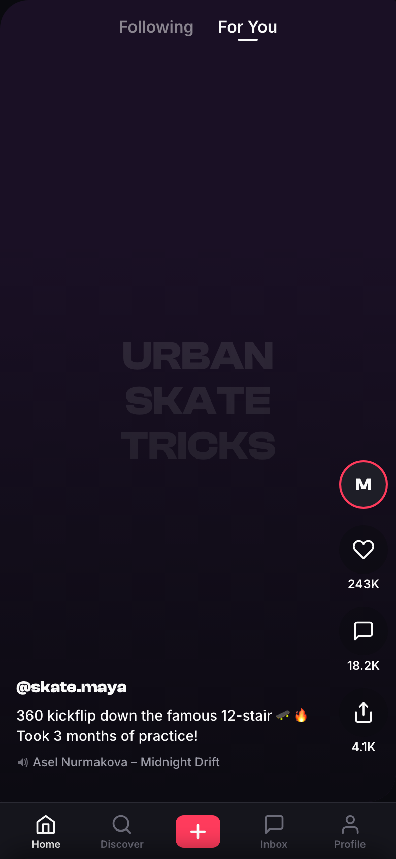
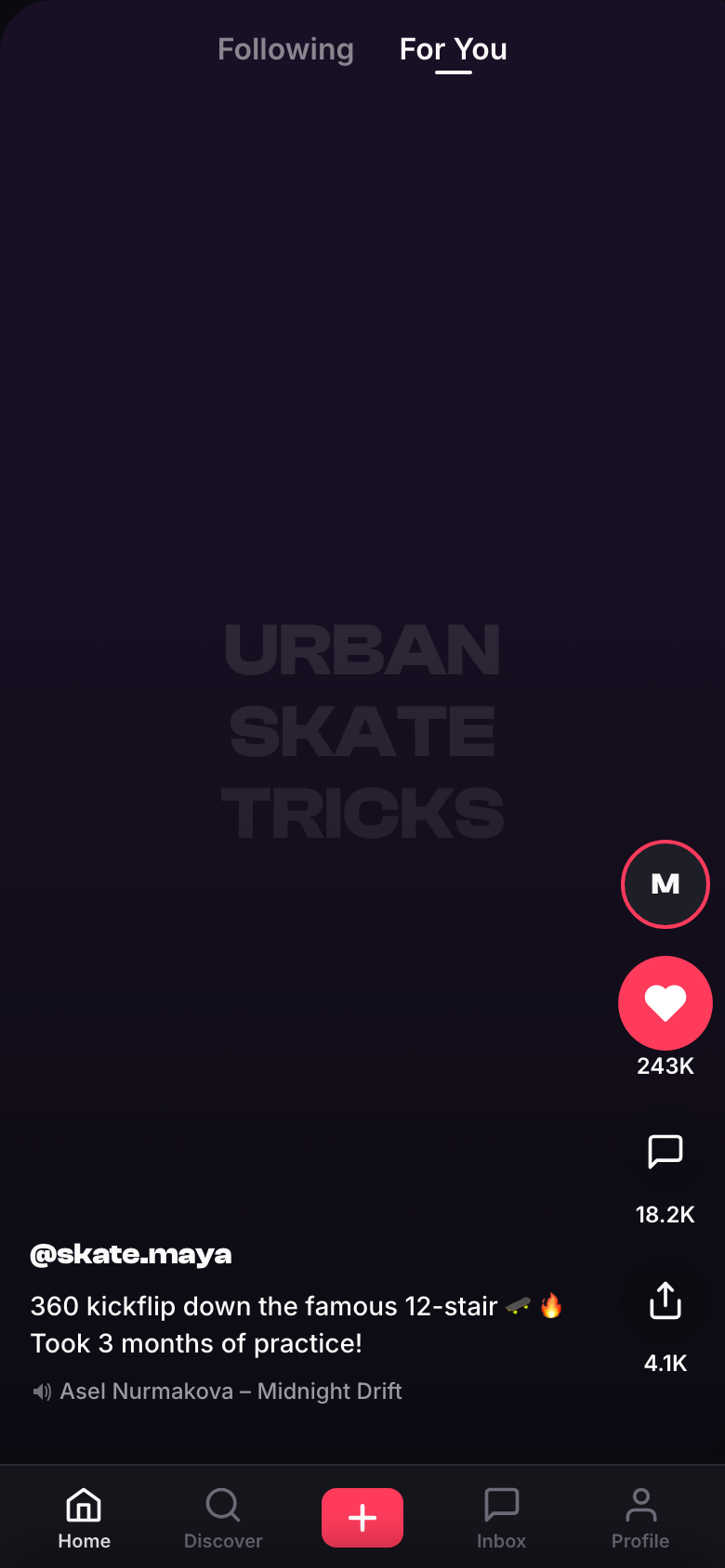
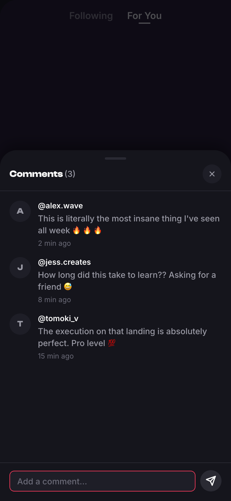
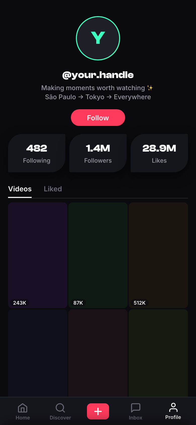
All four scripted interactions succeeded on the first generation: the like toggled to its filled state, the sheet opened with a send button disabled until typing, and the nav switched views. Same model as v1; the difference was the ask.
What source access added
With source access the review produced findings a screenshot pass could not: arbitrary hex backgrounds with no token behind them, raw pixel values bypassing the spacing scale, tertiary text below AA contrast at 12px, a decorative accent glow breaking the action-color rule, and two dead controls with polished hover states and no click handlers.
In one case the like count looked unchanged between the before and after screenshots. Rather than failing it, the critique traced the JavaScript, confirmed the increment fires (243,000 → 243,001), and identified the count formatter as the reason the change is invisible at "243K".
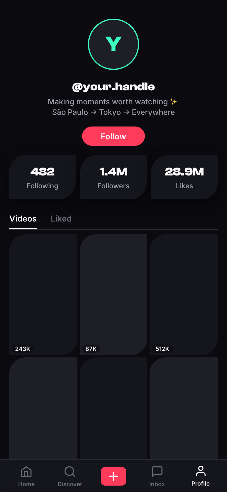
V1's most consistent failure was revisions that simplified. V2's revise step adds a constraint: fix only what is flagged and remove nothing. It held on this run, since every card, count, control, and test hook survived and all four interactions passed again. One clean run is a single data point. Open the V2 build →
Version three: React components
A single HTML file is not what a product team ships. V3 changes the output to React function components: props-driven, composed by an App that owns state, with every color, spacing, radius, and timing read from a TOKENS object. The critique gains a third dimension alongside design rules and functional checks — code quality, meaning props-driven components, no magic values, content passed as data, and state held in one place.
It also raised its own standard. V2's critique noticed that liking a video with 243K likes produces no visible count change and excused it after confirming the logic. V3's critique graded the same thing as a specification failure, since a demo seeded at 48.2K cannot show that the count visibly changes.
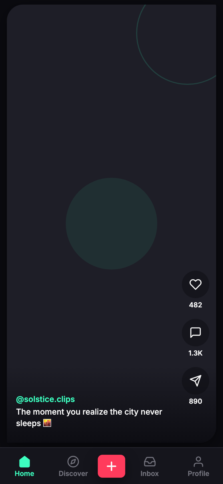
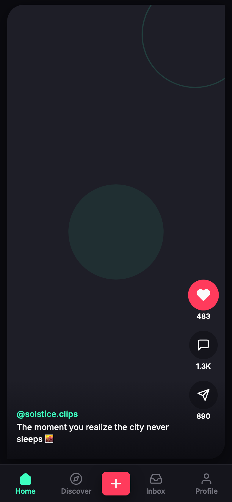
The revision fixed the architecture (magic values down from 14 to 1, all content passed as props, and comment state lifted into App, which removes the vanishing-comments bug) and reseeded the like counts to small numbers so the increment is visible: 482 → 483.
Try the generated app
Below is the revised output of the pipeline, with every component, style, and interaction as the model produced them. The only processing is mechanical: the JSX is compiled ahead of time and React is bundled into the file so a CDN outage cannot blank the embed (raw artifact, byte for byte).
Interactions are real, data is hardcoded, nothing persists. Tap the heart, open the comments, switch tabs.
A bug in the test harness
The pipeline logged warnings that the nav test hooks were missing from both builds, but every automated nav click succeeded and the profile screenshots confirm it. The warning was a false positive in my own harness, which greps for literal data-testid strings while React builds them dynamically. The check was written for V2's output format and never updated for V3.
Earlier the weak link was the constraint files; here it was the test harness. When the thing being verified gets more sophisticated, the verifier has to be re-checked too.
What the three versions showed
Across three versions the same model produced a static card, a working app, and a componentized codebase with its architecture reviewed and corrected. The loop stayed the same; what changed was the contract, meaning what the generation was asked for and what the critique could check. The rule set has to be audited first, since my own contradiction corrupted a documented conclusion. Verification also has to touch the artifact: driving the app with real interactions found dead controls that screenshot critique could not.