The Problem
Why the current app was slow to use
The existing UCSD dining app gave students with dietary restrictions no quick way to find meals they could eat. Each visit meant checking every dining location one at a time.
The prototype covers dietary preference defaults, cart, checkout, and order history, using UCSD's official brand colors.
Live Prototype →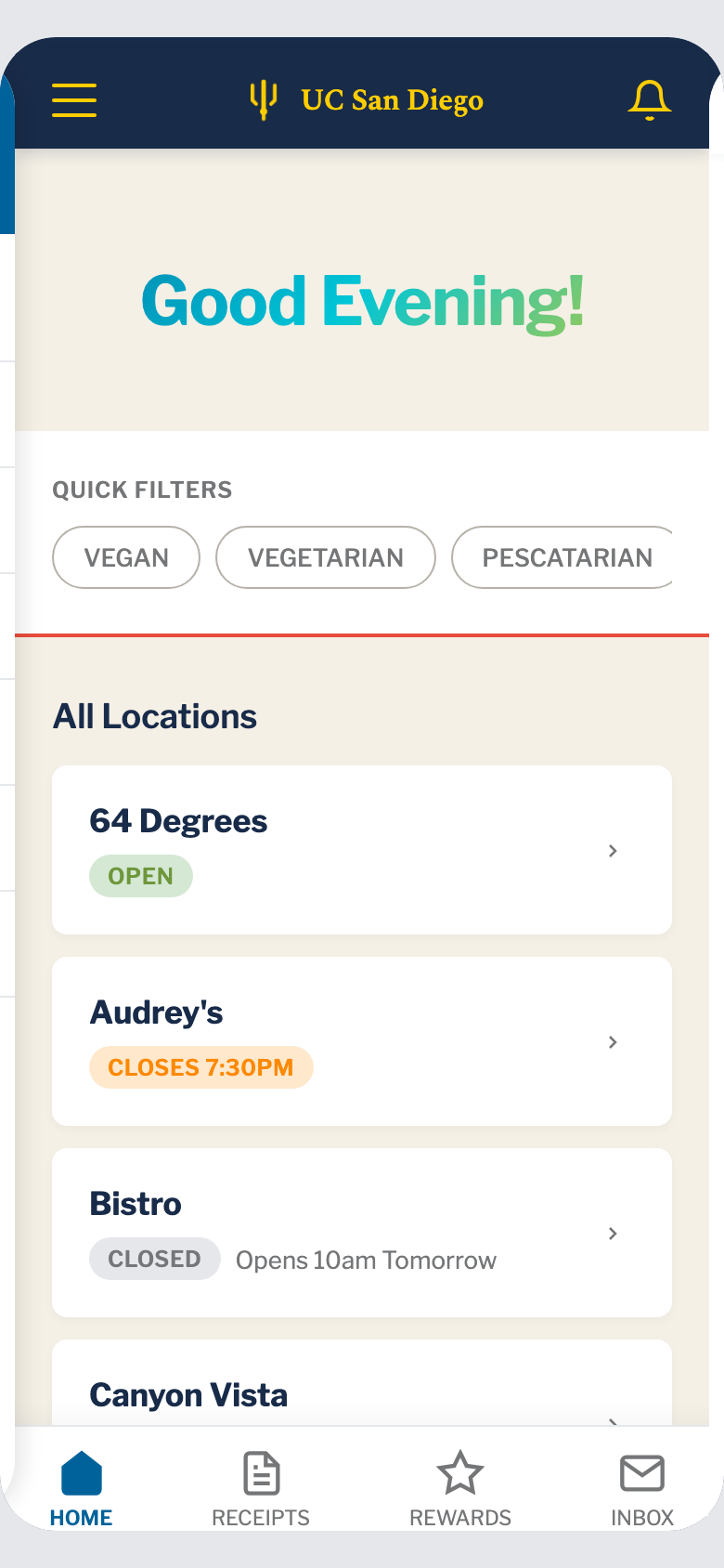
Key Design Decisions
Making filters the first step
In the original app, dietary filtering sat in settings and reset every session. In the redesign it comes first: preferences are set upfront and stay applied for the rest of the session.
Each location also shows a live count of matching items, such as "3 matching items". That turns the app from a menu browser into something a student can use to pick a location before crossing campus.
Prototype Scope
What the prototype covers
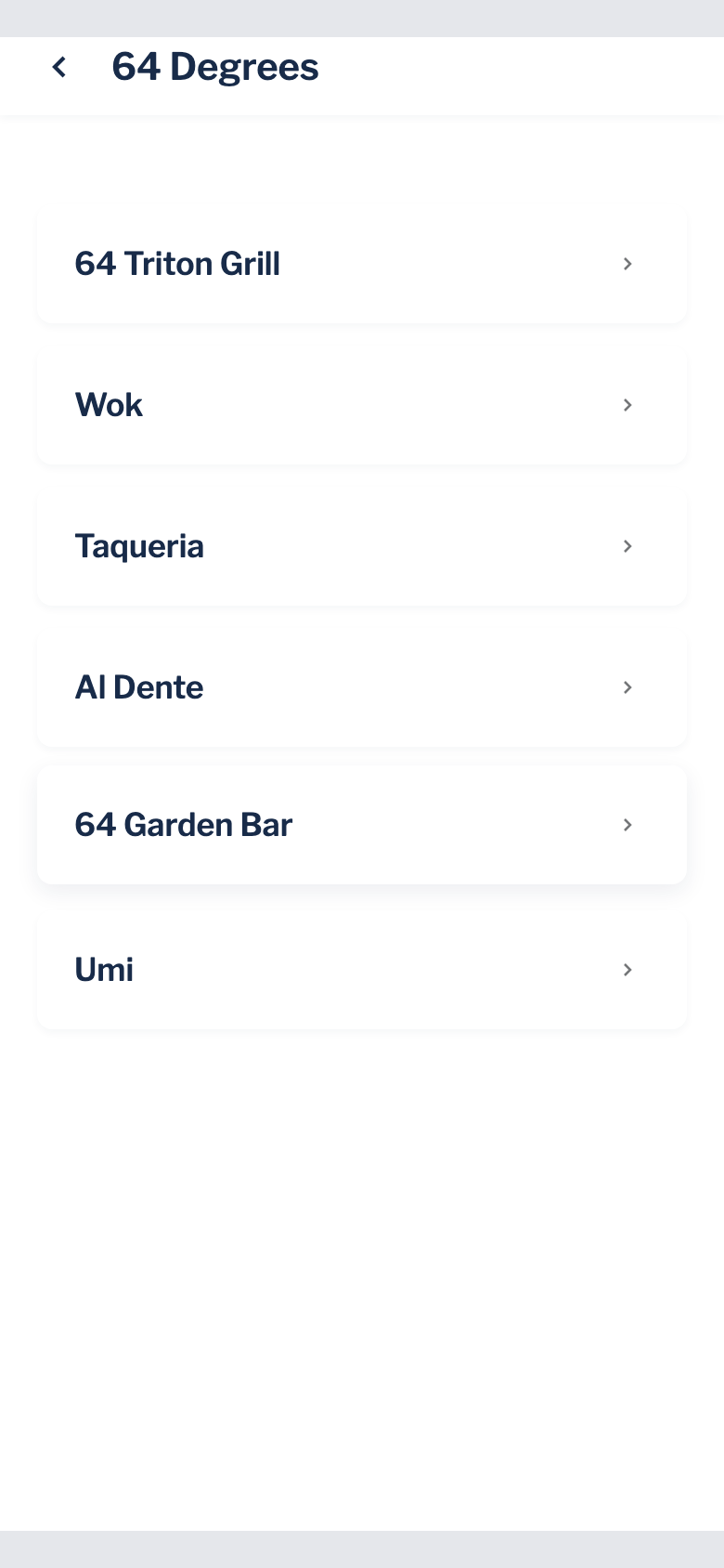
The prototype runs the full flow in the browser: filter selection, location browsing with live counts, menus with dietary tags on each item, cart, checkout, and order history.
UCSD's brand colors were a constraint from the start, since the result had to look like an official campus product.